Single-line Input
Scenarios
Used to input single-line content
Basic Function Description
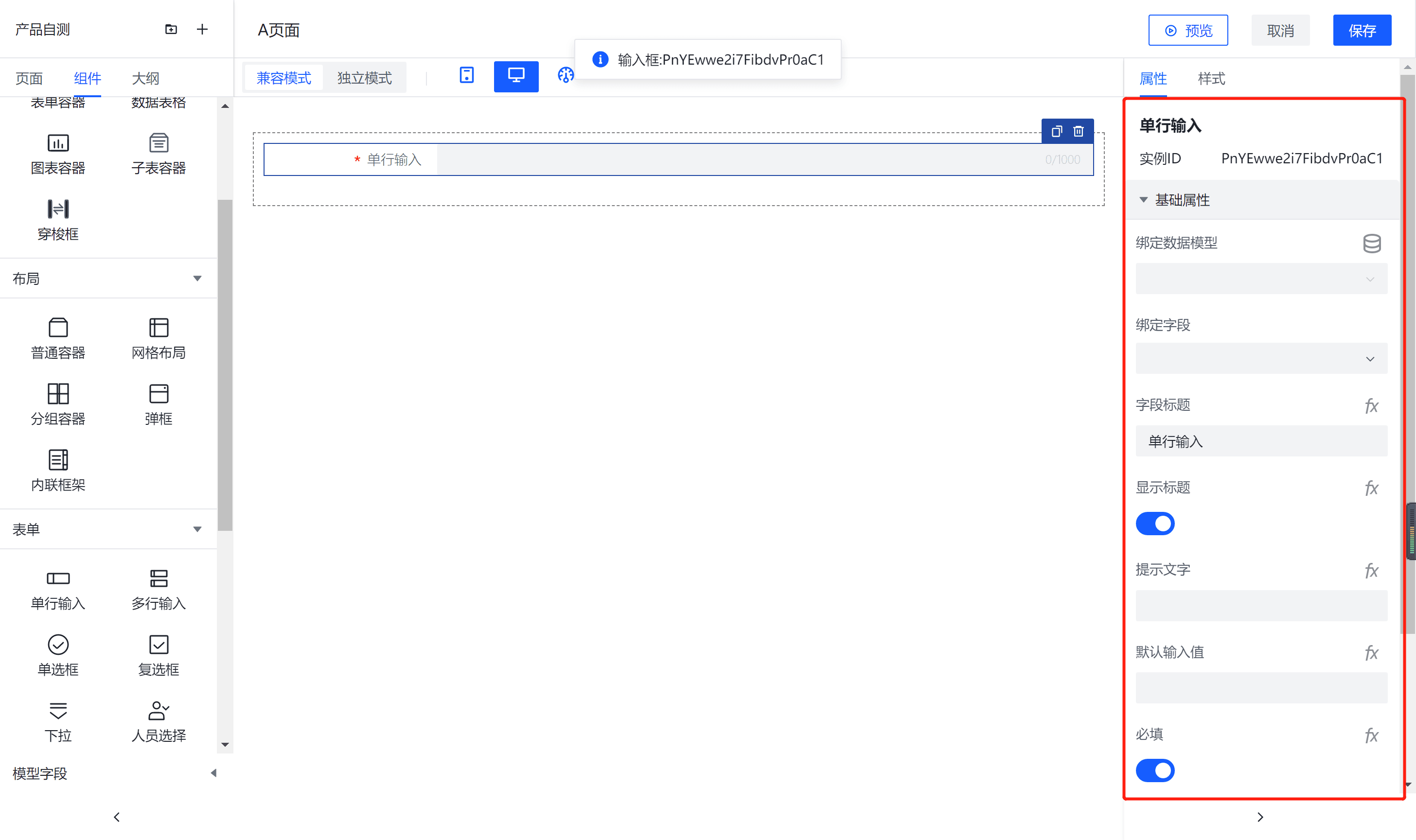
1、After binding a data model to a form container, you can use the single-line input component to input single-line data. It is configurable for input value, placeholder text, component size, and whether it should stretch horizontally (the component size and horizontal stretching are effective on PC but not on mobile).
2、It supports personalized configuration of the title, including the title's content, alignment, line breaks (when enabled, titles that exceed one line wrap; when disabled, titles exceeding one line are truncated), title position, width, and title hint.

3、It supports personalized configuration of the input box, including whether the input box displays a clear button, prefix/suffix text, prefix/suffix icons, bottom hints, whether it is displayed as a password, input keyboard type, character count display, and whether it automatically gains focus.

Note:
The prefix and suffix text in the form will be submitted to the data model along with the input content; Size configuration only applies to the PC platform; If the component is placed within a form container, the component size, title alignment, position, line breaks, and width will by default follow the properties configured for the form container
Property
Properties received from external input for the component
| Property Name | Property Description |
|---|---|
| Data Model | Displays the data model available for the current component in the container |
| Bind Fields | Display the data fields that can be selected from the available data model for the current component |
| Field Title | Displays the field title for the current component |
| Display Title | Indicates whether the current component displays a title; it can be hidden if not needed |
| Prompt Text | Information the current component needs to prompt the user for input |
| Default Input Value | The default value for the current component, if applicable |
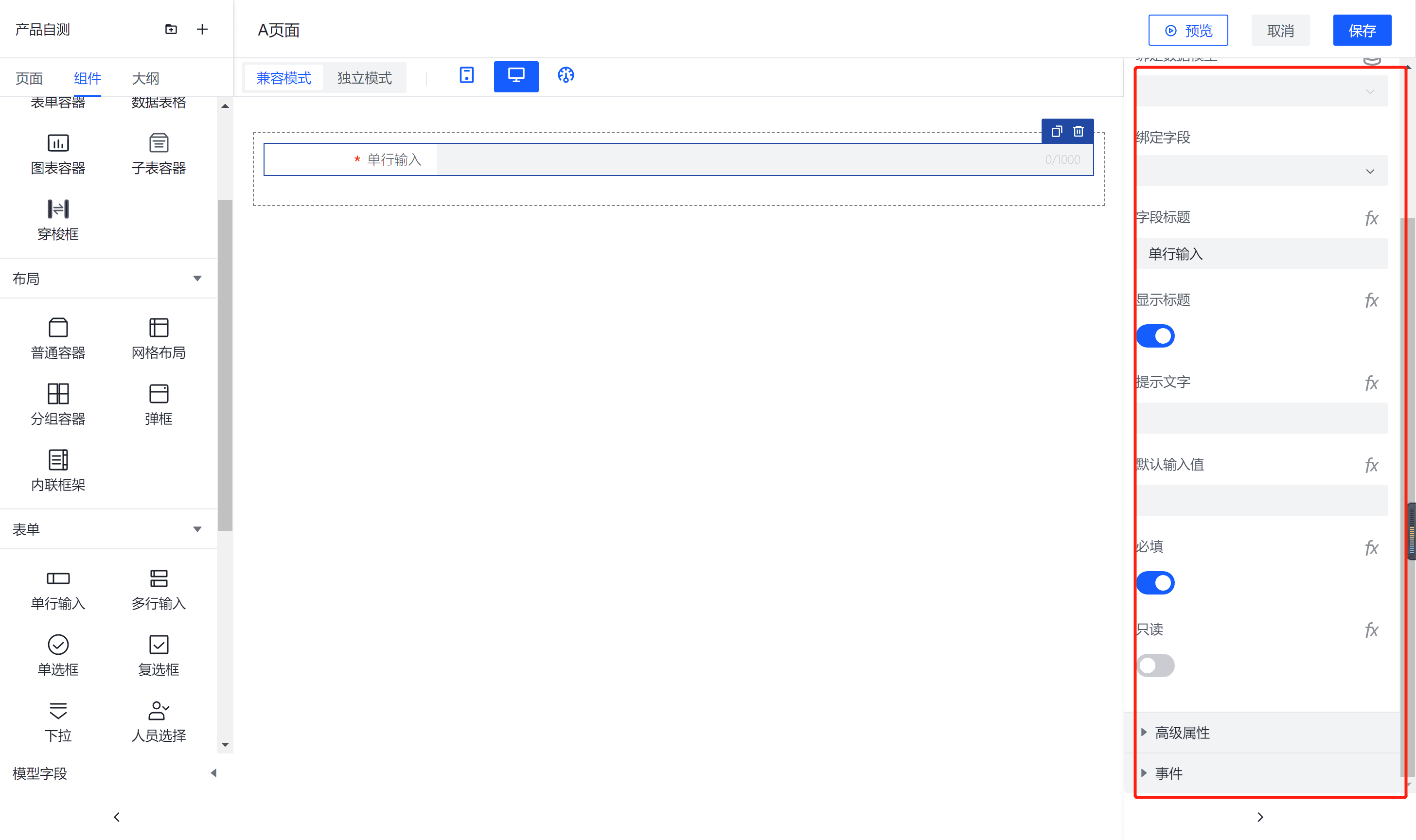
| Required | Specifies whether the current component is a required field |
| Read-only | When the current component is read-only, it is set to a disabled state |
| Width | The width of the current component |
| Character Count Display | Shows the character count of the input entered into the current component |
| Maximum Input Length | The maximum length of input allowed for the current component |
| Password | Whether the current component is a password input field |