Style
Latest Update:Jul 5 ,2023, 10:00:06
Style Configuration
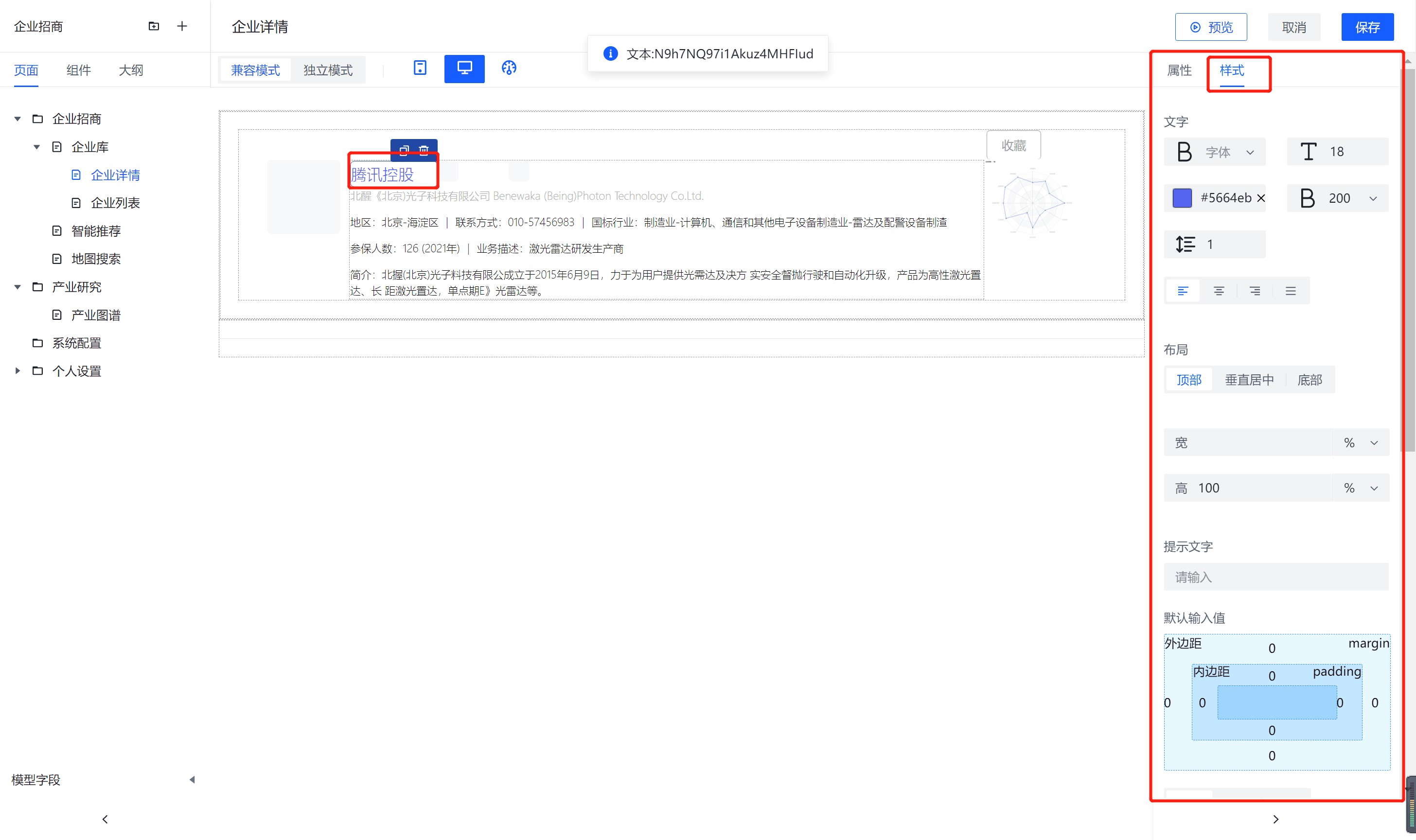
The component provides a quick editing feature for styles. After selecting the component in the page editor, you can find the property configuration area and the style configuration area on the right side of the editor. Click the "Styles" tab to customize the component's style. Basic style configurations include text, layout, padding, and advanced settings. Here's a detailed explanation of the style configuration functions:

Text
You can adjust the font, font size, font color, font weight, line height, and alignment of the text.
 {:width="200px" height="200px"}
- Font: You can manually select the font used by the current component.
- Font Size: You can manually input the font size to adjust text size.
- Font Color: You can click to select the text color.
- Font Weight: Font weight options include bold, normal, and light.
- Line Height: You can manually input a number to adjust the line height of the text.
- Alignment: Text alignment options include left-aligned, center, right-aligned, and justified.
Layout
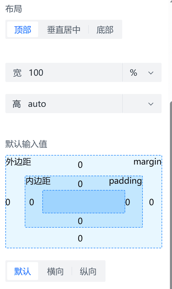
Layout allows you to adjust the width, height, dimensions, padding, and margins of components. You can configure the arrangement and alignment of multiple components within a container, and you can control the layout visibility of components.

-
Width and Height: You can set the width and height of the component, and you can choose from units like px, rpx, %, and rem.
-
Padding and Margin: You can input numerical values to set the margin and padding for the top, bottom, left, and right sides of the component.
-
Hidden Layout (Not Yet Implemented): You can click the icon to hide the component's layout (display: none) in the editor, and click it again to unhide the layout.
-
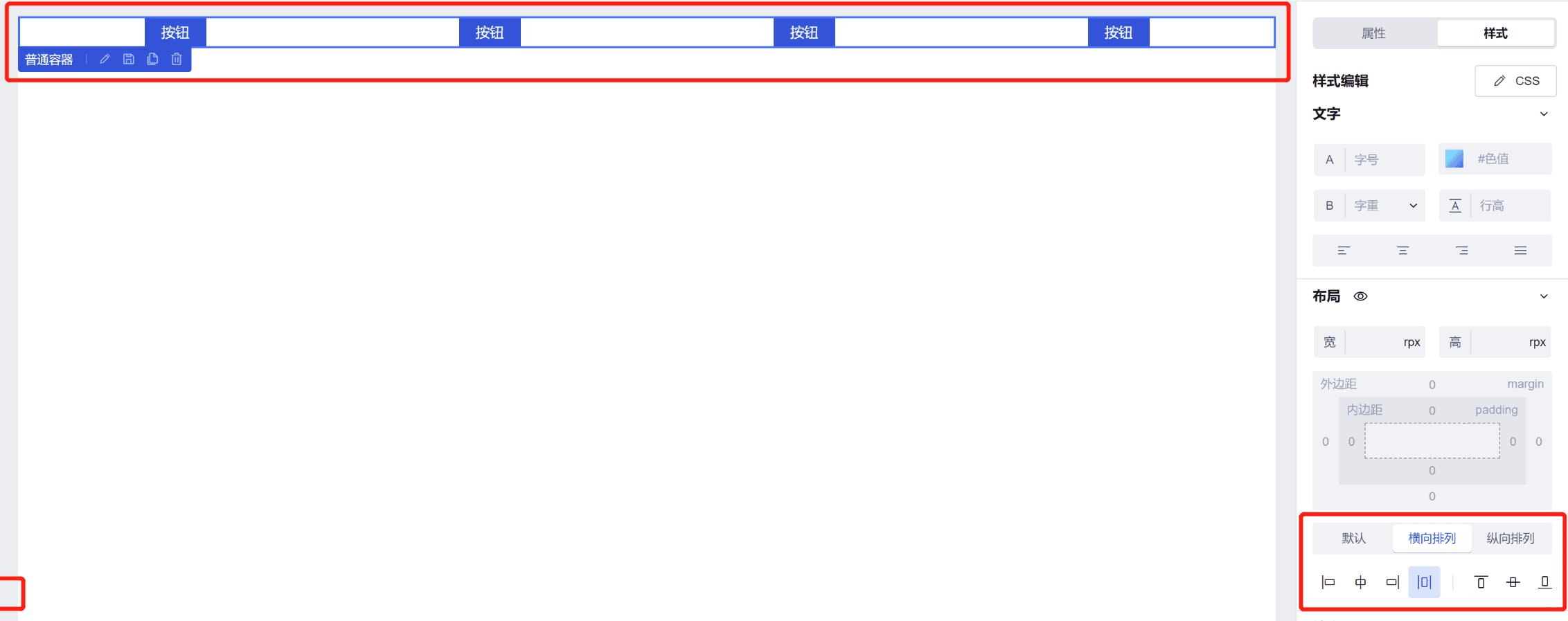
Layout Modes (Not Yet Implemented): Layout modes include arrangement and alignment. Arrangement options are Default, Horizontal, and Vertical. Alignment options are Left, Center Horizontally, Right, Equal Spacing, Top, Center Vertically, and Bottom. Layout modes are typically used for scenarios with multiple components in a single container. For example, if you have multiple button components in a common container and you want to evenly space them horizontally, you can select the common container, set it to Horizontal arrangement, and choose Equal Spacing. The effect will be as shown in the image below:

Border
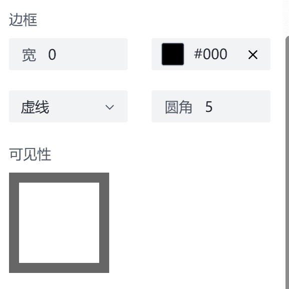
You can adjust the border of a component or container through the border settings:

- Width: You can set the border width using a numeric value.
- Color: Choose the border color.
- Type: Define the border style, which can be solid, dashed, or dotted.
- Radius: Set the border radius to create rounded corners using a numeric value.
- Visibility: Adjust the visibility of each side of the border (top, bottom, left, right). You can set whether each border should be visible or not.